A study in contrasts: light, shadow, and the rhythm of the game.
Background & Problem
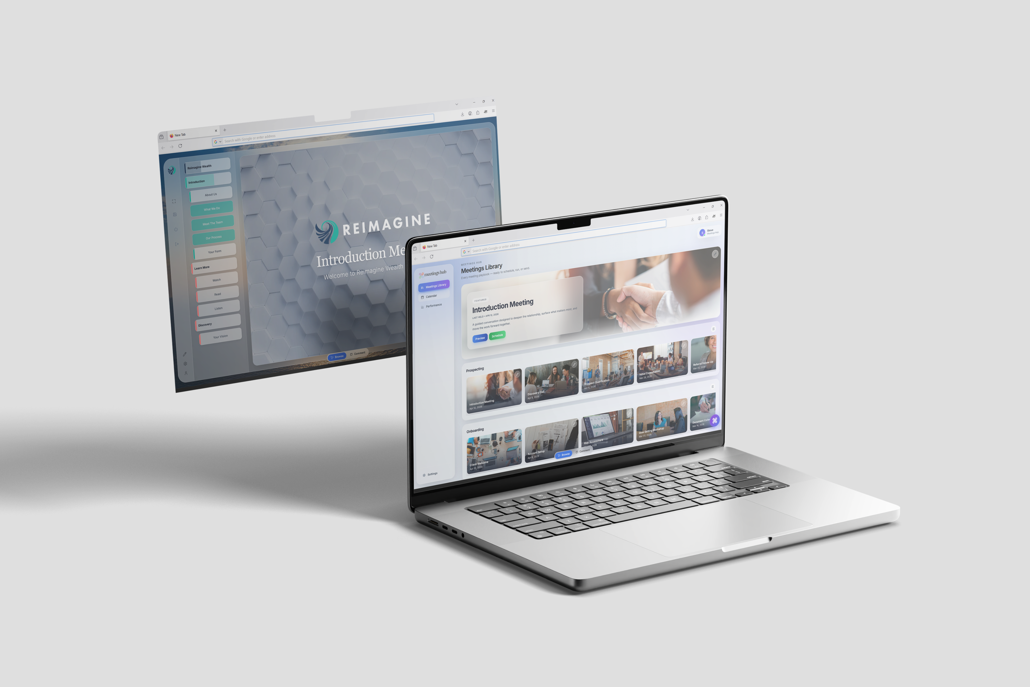
The Meetings Hub is a Software-as-a-Service (SaaS) platform designed to deliver hyper-personalised meeting experiences tailored to each client’s financial life journey. Built for financial advisors, the platform serves as a centralised environment where data from multiple sources—such as CRM systems, financial planning tools, and supporting documentation—can be seamlessly integrated, structured, and presented within a single, cohesive meeting interface. Positioned as a first-of-its-kind patented solution, The Meetings Hub aims to streamline the advisory process while enhancing client engagement through clarity, personal relevance, and efficiency.
Despite its unique and innovative position, the platform faced challenges with user retention and overall user experience. Advisors struggled with complexity in navigating and utilising the system effectively, limiting adoption and long-term engagement. Recognising the need for a more intuitive and user-centred approach, the team engaged me as a UX product design lead to reassess the product experience. With a strong technical foundation already in place, the team found opportunities to refine usability, improve visuals, and better align the platform with the needs of financial advisors.
Project Definition
The Meetings Hub initially identified a challenge with user retention: while customers successfully onboarded and used the platform as intended, many chose not to renew their subscriptions at the end of their contract period. Early attempts by the development team focused on introducing new features to improve engagement; however, these efforts did not address the underlying usability and experience issues that were impacting long-term adoption.
In response, the product team reframed the problem, setting out clear objectives to identify, validate, and resolve core user experience pain points. The goal was to better align the platform with user needs and workflows, ultimately improving customer satisfaction and increasing retention among existing clients.
The Team
Reflecting the scale of the business, the team was lean and cross-functional, comprising a project manager, a back-end engineer, a front-end engineer, a visual communications executive, and myself as the product designer. This structure allowed for close collaboration and rapid iteration across all aspects of the product.
We worked closely with senior leadership and directly with clients to gather continuous feedback, ensuring that proposed improvements aligned both with business objectives and the practical needs of end users.
Research & Validation
We began with an audit of the existing platform to identify visual inconsistencies and navigational friction. This initial review surfaced potential usability issues, which we then took forward for validation through user interviews.
To better understand how the platform was being used in real meetings, the front-end developer and I conducted interviews with active clients, focusing on user journeys, pain points, and overall sentiment toward the product experience. We interviewed three clients, and their feedback revealed consistent issues that validated our audit findings.
Key themes centred on visual inconsistency and unclear navigation, while users also requested new features. It became clear that foundational usability issues were the primary barrier to effective use of the platform, so I began exploring design patterns and interaction models from comparable products to inform a more cohesive and intuitive approach to layout, visual hierarchy, and navigation.
Ideation
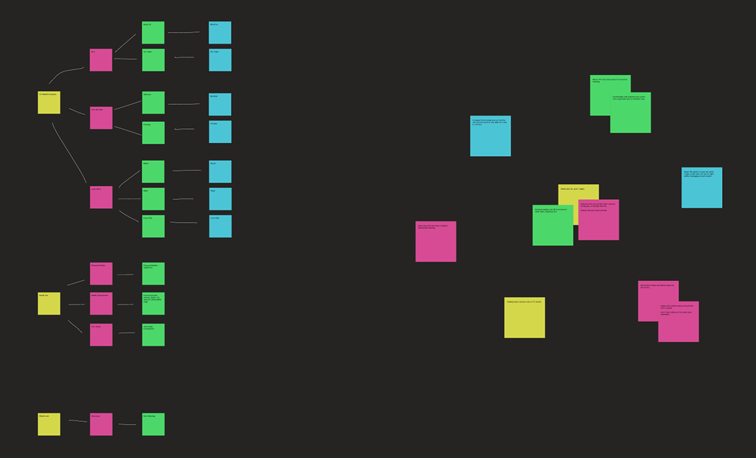
Once we had gathered the interview data, the team used affinity mapping to group related feedback and identify patterns. From this, we pinpointed key areas for improvement, defined problem statements, outlined potential solutions, and discussed their feasibility in terms of effort and impact.
This work was primarily shared between the project manager, the visual communications executive, and myself, allowing us to think broadly about potential solutions before narrowing in on the most impactful and achievable changes. This strategic thinking balanced time and effort with value and feasibility. We shelved concepts that were expensive, complex, or time-consuming to implement, and focused on improvements with a strong balance of impact and achievability.
Dockside perspective, capturing the soul of the water.
Design, Iteration & Testing
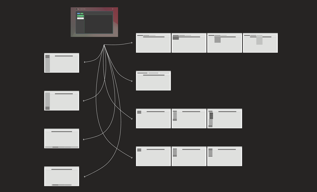
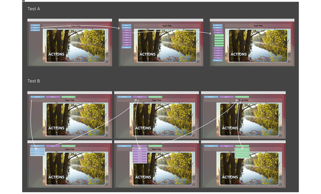
From there, we brought the shortlisted solutions to life as low- and mid-fidelity wireframes in Figma. We deliberately avoided drastic changes to the environment that clients were already familiar with, instead targeting “quality of life” improvements that would enhance the experience without disrupting workflows. Our starting point was the in-meeting navigation—one of the most frequently used areas and a clear source of frustration in interviews.
The existing breadcrumb-style navigation was described as opaque and overly dynamic; when users navigated to a new page, the current page would be removed and items reordered, making it difficult to maintain a sense of place. We addressed this behaviour first, then explored how to make the list of navigable pages more visible, predictable, and accessible.
Dockside perspective, capturing the soul of the water.
As part of my design process, I aim to explore a wide range of options, the strong, the middling, and the bad, helping to challenge assumptions and refine direction. Using Figma, I rapidly created several wireframes to explore different navigation layouts, working with a standard 1920×1080 desktop format informed by publicly available data indicating that this is still the most common resolution among PC users.
After reviewing the options, we selected two designs to develop into high-fidelity prototypes, as they offered the best balance between ease of implementation and potential user impact. I then built interactive prototypes in Figma so users could experience and test the new navigation patterns without any engineering effort.
We ran A/B tests with these prototypes, asking users to navigate through the meeting “Conversation Areas” as they normally would. Feedback was positive for both designs, but there was a clear preference for the design with visible navigation on the left, particularly due to reduced time spent moving between sections and the ability to see what was coming next in the meeting.
A study in contrasts: light, shadow, and the rhythm of the game.
Iteration, Iteration, Iteration
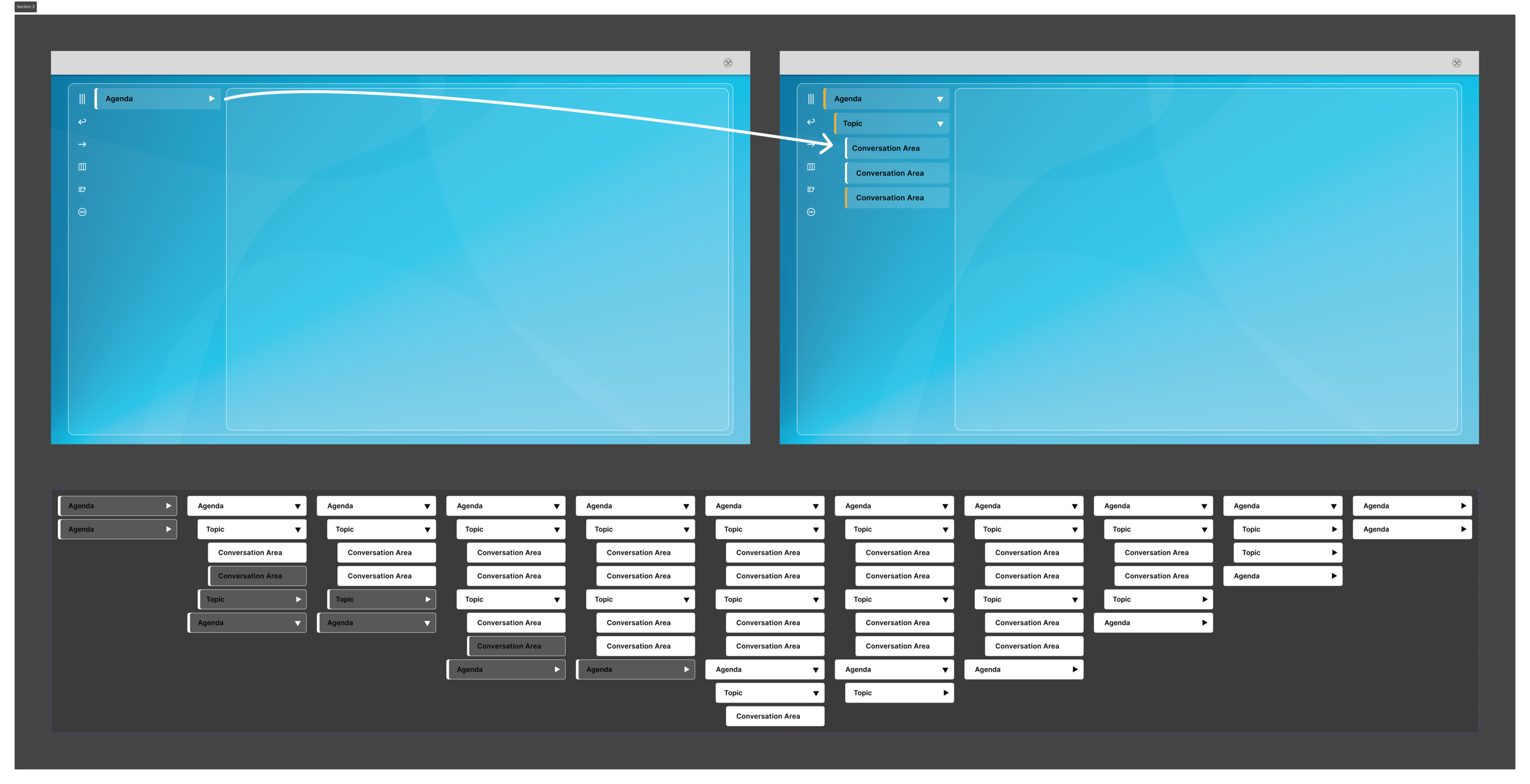
With the testing insights in hand, we returned to refine the preferred design from Test Group A, which had generated the strongest response. We focused on creating a more intentional, dedicated navigation area clearly separated from meeting content.
Key improvements included introducing a left-hand navigation menu with a calmer, more consistent visual style, adding accordion behaviour to support meetings with many topics and conversation areas, and using visual states to indicate previously visited sections. We also surfaced previously hidden navigation and meeting controls to make them easier to discover and use.
In parallel, we revisited padding, margins, and whitespace to maximise the space available for presenting client content, while giving the platform a more polished and deliberate feel.
Dockside perspective, capturing the soul of the water.
Testing
Once we had incorporated the initial round of feedback into the navigation and layout, we brought a more refined version of The Meetings Hub experience back to our testing group. The remaining testers had a positive interaction with the updated designs and reported a clear improvement over the original product.
Testers highlighted that the more obvious navigational elements were easier to understand and use, particularly now that key actions and sections were no longer hidden behind dropdowns and ambiguous menu icons. With features now testing positively, and both management and customers eager to see the improvements released, we prepared handover documentation for the development team, who had already begun implementing some of the simpler changes.
Reflections
Looking back on the project, I am proud to have contributed in a meaningful way to making The Meetings Hub a more intuitive, user-friendly platform by grounding design decisions in foundational research and testing. Shortly after this work was completed, leadership mandated that the platform be rebuilt on a new codebase, but the navigation concepts and interaction patterns carried over to the new platform, demonstrating the strength of the underlying design decisions.
If given the opportunity to evolve the project further, I would focus on conducting broader testing with a wider range of users to capture more diverse workflows and contexts. Due to the size of the business and its customer base at the time, this level of reach was not feasible during design and development, but it remains an important area for future improvement.